Designing an “Iceberg” Feature: Grade Posting Setting
Teachers needed to control when students and families could see assessment grades, but the existing system automatically published results immediately upon grading. Through quick research, in-depth mapping, and collaboration with developers, I navigated complex technical constraints and a tight timeline to deliver a feature that gave teachers the flexibility they needed, retained a strategic district client, and closed one of our most-requested assessment features.
My Role: UX Designer
Collaborators: Product Team (Product Designer, Product Director), Development Team
Skills: User Research, Documentation, User Flow Mapping, Diagramming, Sketching, Technical Collaboration
Tools: Google Forms, Figjam/Figma
Problem
Teachers and administrators had no control over when assessment grades and feedback became visible to students and families.
Grades and comments automatically appeared the moment a student completed an autograded test or when a teacher finished grading a single student's assignment. This created issues in some scenarios: test security concerns when classes took the same exam at different times, inequitable feedback delivery where some students saw their grades days before peers, disrupted grading workflows, and complicated communication between educators and families.
As one teacher explained:
"I would love to have the option to schedule the release of students' grades for any assessment type... Grading essays for five classes takes several days, and I'd rather release the scores all at once instead of some students having to wait longer than their peers."
The feature was critical for business reasons too: a strategic district client needed this functionality to align with their grading policies, and it was one of our most-requested assessment features.
However, this project presented a unique design challenge: an "iceberg" feature with minimal UI changes but massive implications beneath the surface and obstacles due to the constraints of our infrastructure. We also needed to account for everywhere grades appeared across the platform to all our user types and ensure the system behaved correctly in each context.
Challenge
How do you design an "iceberg" feature with minimal UI and substantial logic underneath, especially in a limited timeframe and within technical constraints?
Solution
Despite technical and infrastructure limitations, we delivered an efficient, clear workflow. I designed an assessment setting that educators configure when assigning an assessment. They can choose whether grades post immediately (current behavior) or remain hidden from students and families until manually posted. (Scheduling was reserved for a subsequent release.)
Educators see clear visual indicators showing an assignment's posting status in multiple locations where they see assessments in the platform. This allows teachers to easily determine if they're ready to post or need to complete more grading, then post grades for that class and any others where it was assigned.
Impact
We prevented an important district client from churning and closed one of our much-requested assessment features. Teachers now have the control and flexibility they need to manage their grading workflows while maintaining equity and clear communication with students and families.
My Approach
Understanding the Need Through Quick Discovery
I started by reviewing educator comments on our feature request forum and collaborating with the product team to identify our assumptions and open questions. A critical early question: Do teachers choose their approach for each assessment, or do they follow the same practice every time?
To inform our direction quickly, I created and distributed a survey to educators who had requested this feature. While our limited timeline meant we couldn't conduct extensive user research, the responses provided enough confidence to proceed.
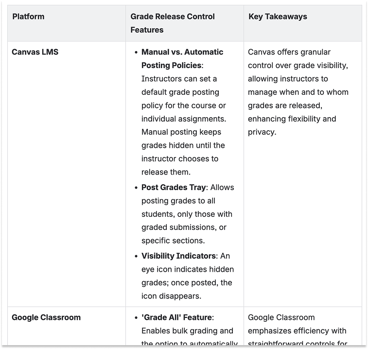
I also examined competitor platforms like Canvas, Schoology, and Google Classroom to identify patterns users might already expect.
Findings shaped our basic solution criteria:
Students and families should only see grades when educators were ready
Educators can choose to delay grade visibility on an assessment-by-assessment basis
Educators must clearly understand the visibility status of their assessments
Posting for multiple classes at once is key to the workflow for educators
Gradebook and analytics calculations must reflect correct published/unpublished logic to all user types; i.e. students and families should not see unexplained changes in class grades or standards grades.
I documented this research and our direction in a project brief.
Deliverables: Survey, Summary of Survey Results, Project Brief
Mapping the Scope & Current Logic
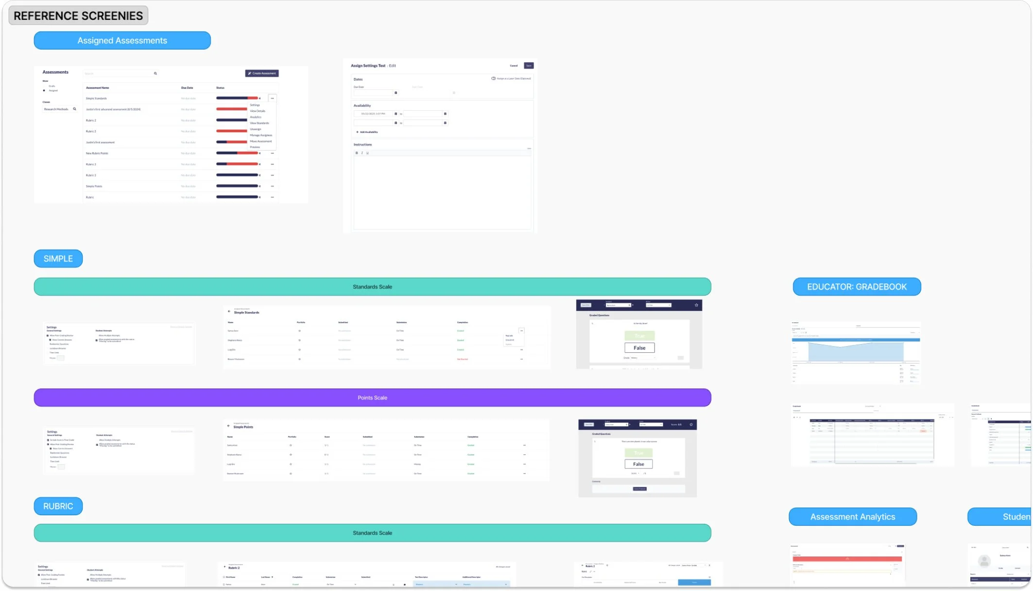
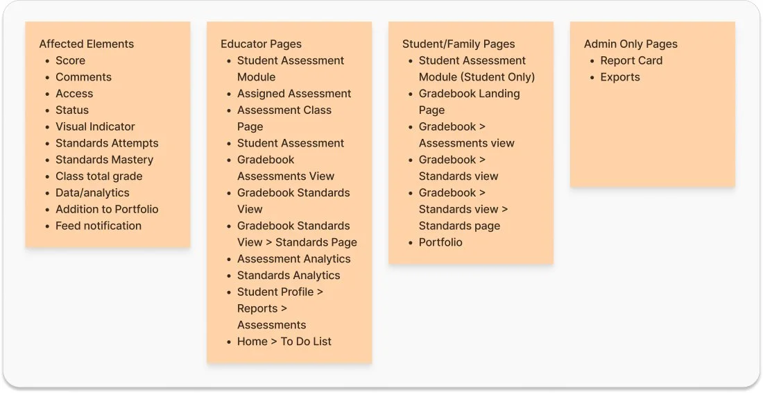
Next, I conducted a thorough audit of the platform, documenting every location where grades appeared and screenshotting each instance. I reviewed our existing business logic for assessment settings, status labels, and how assessments moved through their lifecycle.
This audit revealed just how widely this feature would ripple across the platform and what we would need to account for in the design.
Deliverables: Platform Audit Documentation & Reference Screenshots, Business Logic Documentation & Diagrams
Initial Ideation to Reveal Questions
I wrote two simple user scenarios to focus the design process and began drafting user flows for choosing and editing the posting setting.
An early decision simplified the scope significantly: we would only allow posting by class rather than by individual student. Initial discovery suggested that teachers wanted to release grades all at once, so supporting individual posting in the MVP would add complexity while not addressing the core need.
However, I quick ran into tricky questions and obstacles to our solution criteria that we needed to work through.
Deliverables: User Scenarios, User Flows
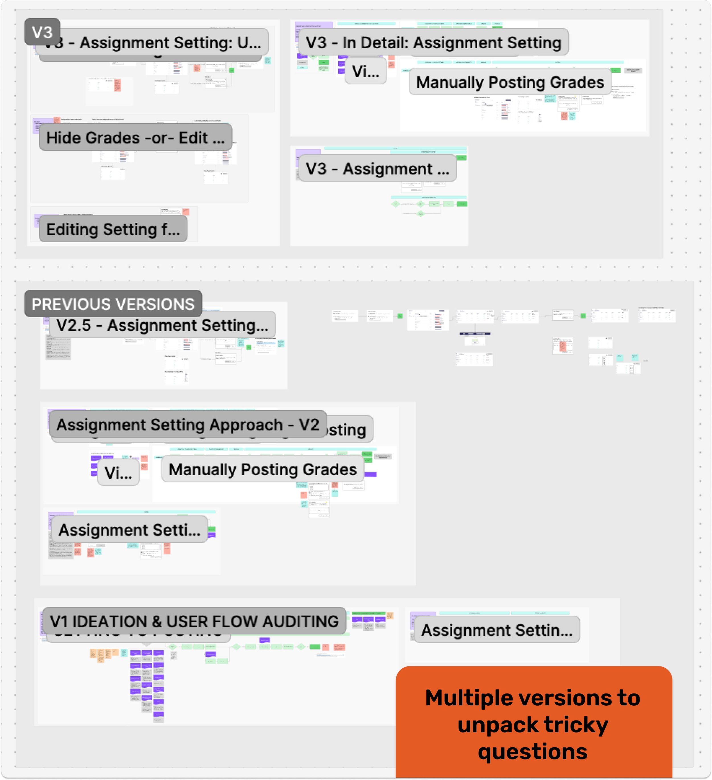
Untangling Complexity: Answering the Hard Questions
The most intensive phase involved working through intricate cases and system implications. Using sketches and diagrams, I explored multiple scenarios:
Editing the Setting: What happens if a teacher edits the setting after grades already exist? We worked through numerous variations and their cascading effects.
Simplifying Choices: We experimented with three different selection options but realized this was really a binary choice with one enhancement. The final design offered two clear paths: "Post Immediately" (the existing behavior) or "Hide Until Posted" (with an optional scheduling feature for future phases).
Option Hide Again: Should teachers be able to hide grades after posting them? This felt like solving for an edge case and solving for editing complications, rather than a core workflow. We decided to discuss with developers before committing.
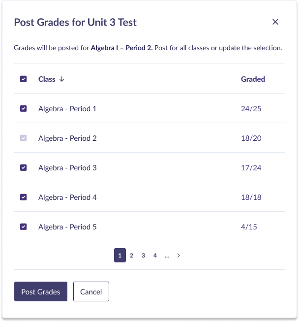
Multiple Classes Problem: Our platform’s structure posed an obstacle to efficiently posting an assessment to multiple classes: you could only see assigned assessments by class. There was not a natural place where users could select all of the classes an assessment was assigned in, and then batch post. I explored other variations of the solution that included reconfiguring our assessments feature to provide a unified view of one assessment across all classes.
While this would have elegantly solved several awkward workflows, it would explode our scope beyond what we could deliver in weeks. Instead, I designed a middle-ground solution: when posting grades for one class, teachers would see a confirmation dialog offering to post for all other assigned classes simultaneously. They could also see how many tests were graded in those classes to give them a signal of posting readiness. This preserved the critical ability to post everything at once without tedious repetition and avoiding major restructuring.
Along the way, I collaborated with my product team colleagues to explore these scenarios.
After iterating through multiple variations, I created a visual flow using sketches and annotated screenshots to discuss with the development team.
Deliverables: User Scenarios, User Flows
Collaborating for Feasibility
In a key session with developers, I presented the problem, walked through the ideated solutions, and addressed our open questions using the FigJam board I'd built during ideation. We gained clarity on what was in and out of scope for our aggressive timeline.
The developers confirmed they could probably support posting to multiple classes at once; they just needed to explore the technical ramifications. They agreed that reconfiguring the feature for this efficiency was too broad in scope. They were also pleased we'd scoped to class-level posting only, not individual student assignment posting. Hiding grades again would also add more work, so avoiding this would help reduce scope.
This feedback allowed us to more confidently refine our MVP.
Refining the MVP
Based on technical constraints and timeline realities, we made scope choices:
Post Immediately vs. Hide Until Posted only (scheduling moved to future phases)
No editing the setting after grading begins: once one student was graded, the posting setting was not able to changed.
No hiding grades after posting: while somewhat concerned about not having an “undo” option, it seemed from discovery that releasing grades was generally a one-time event anyway and we had to reduce scope wherever we could to work within time constraints.
While developers conducted a technical spike, I sketched the final MVP version and worked with the product designer to create high-fidelity mockups of the needed components, though there was not much UI to design. We did another careful pass on the UI microcopy to ensure clarity. The product director then partnered with developers to deliver the feature.
Deliverables: Refined Sketches, High-Fidelity Mockups, UX Writing, Updated Project Brief
Reflection
So how do you design an "iceberg" feature with minimal UI and substantial logic underneath, especially in a limited timeframe? Here's what I learned:
Persistently work through the complexity. Yes, you have to tackle the intricate rules in detail even when it feels brain-breaking. Visualizing workflows and externalizing thoughts onto a whiteboard helps untangle the knots and reveals hidden implications.
Collaborate with developers. Understanding technical scope and constraints is essential when designing cross-platform features with tight deadlines. That collaborative session helped us scope down to something realistic and make trade-offs we could live with.
Resist scope creep through focus. It's tempting to fix related problems while working in an area of the platform. Staying disciplined and limited in scope allows you to deliver value sooner. We can always grow the feature in future phases, and we built it with that growth in mind.